What Are Click Curves and How to Use Them for SEO
 Written by James Parsons • Updated April 15, 2026


Marketers love data, and using data to make decisions is the foundation of good marketing. The better your data, the better the decisions you can make, and the better your results will be.
That's why most analytics platforms are adding more and more metrics, especially derived and calculated metrics. Click curves are one of those metrics, and you may have seen them on the dashboard for certain analytics apps and wondered what they were. Today, I want to try to explain them, how to calculate them, and how to use them. Let's dig in!
Key Takeaways
- A click curve predicts estimated click-through rates for content based on its search ranking using existing site data.
- Building one requires only position and CTR data from Google Search Console, plotted as a scatter chart with an exponential trendline.
- Filtering out branded keywords and outliers improves accuracy; aim for an R-squared value of 0.6 or higher.
- Click curves can estimate ROI, compare device behavior, and reveal seasonal traffic patterns across your content.
- Most analytics platforms already include click curves, making manual creation unnecessary for most marketers.
Table of Contents
What is a Click Curve?
A click curve, also known as a click-through curve or a CTR curve, is a piece of statistical wizardry you can use to estimate the potential click-through rate of a piece of content when that content reaches a given ranking in the search results.
Basically, you take existing data for your pages, their rankings for various keywords, and their click-through rates. You plot these out on a scatter plot, and you find the best-fit curve line. That line can then be used to predict where a new page would fall in terms of clicks when it reaches a certain ranking.
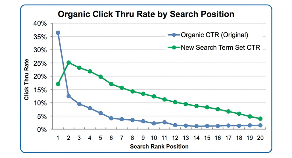
There is, obviously, some variance; since the line is just the average of all of your data points, it's quite fuzzy. A new post reaching a specific rank could under-perform and still be within predictions, or it could over-perform and still count. Or, it could be an outlier for one reason or another, either positively or negatively.
In other words, it's a useful predictive tool, and can show you a bit of guidance on which keywords to target and which ranks you need to aim for to get results. But it's not gospel, it's not always right, and a lot of other factors can alter the results.
What Do You Need to Make a Click Curve?
The good news is, you don't actually need much to make a click curve of your own. The bad news is, without enough data, it might not be a very useful one.
Tools: All you need to make a click curve is a spreadsheet tool that does scatter plots. Both Microsoft Excel and Google Sheets can do it, as can most of the alternatives you'll find out there, or a specialized statistical tool if you want to use one. Though if you're deep enough in stats to have specialized statistics tools and know how to use one, you probably aren't reading my basic guide to scatter plot trendlines.
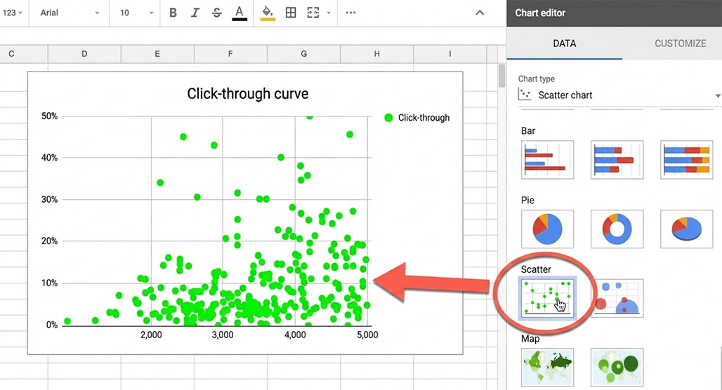
Data: All you need for a click curve is two pieces of data: the position for a page, and the click-through rate of the page.
Generally, for a plot like this, you're going to want to use one piece of data per page. You can use the average of all of the tracked keywords you follow for the page, or you can use the primary keyword.
The click-through rate might be provided by your analytics (you can export it directly from Google Search Console, for example), or you can calculate it yourself on the spreadsheet. It's just the percentage of impressions that result in clicks, so you just need to divide the clicks by the impressions and multiply the result by 100. Easy enough as a formula to add to a spreadsheet, right?
Before you get too deep, make sure you have enough data. If you don't have much traffic, if your CTR is relatively low and the number changes significantly based on just a couple of clicks, and if your number of pages is low, you're going to have a hard time getting useful and relevant data. This is more of a useful tool for mid-sized and larger brands, and isn't very useful for small businesses or blogs just starting out.
How to Make Your Click Curve
Let's go through the whole process for making a click curve, since it's relatively simple in practice.
Step 1: Export Data from Google Search Console
The first thing you need to do is go to your Google Search Console. Log in as an account that can access and export analytics data.
On the left sidebar will be the Performance category, with the Search Results section. Click on that, and you'll be brought to the search performance page.
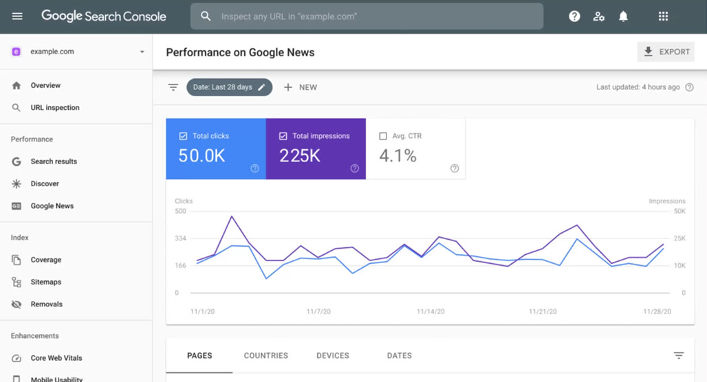
Here, you want to choose your timeframe and add any filters you want for the data. Usually, a 30-day span or a three-month span is good enough, but if your site is relatively low-volume and low-impression, you might need a longer view.
Up in the upper right, you can click an export button once you have the report configured the way you want. This gives you the option to download the data as a .gsheet (Google Sheets), .xlsx (Microsoft Excel), or a raw .csv. Pick your favorite; for the purposes of this post, I'm going to use Excel.
Step 2: Open Data in Excel (or Sheets, etc.)
Next up, you need to open your sheet or CSV in your spreadsheet editor of choice. For Excel, you can either open the .xlsx file or open the CSV; they'll both work the same.
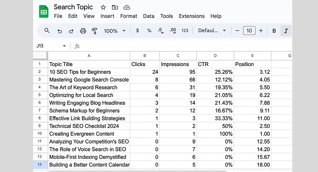
You'll be given your data for each of the views (Queries, Pages, Countries, Devices, Search, Filters, and the chart). You can make a click curve for any of these, but the most relevant are going to be your Queries or Pages. Queries will chart based on keywords used to find your site, while Pages will chart based on the ranking of the page itself on average.
Open your chosen document in Excel, and you'll have a set of columns: Top Pages, Clicks, Impressions, CTR, and Position.
Step 3: Filter Your Data
Now, you want to engage in a little filtering. Go through the list of rows and remove any that are clearly branded pages or search terms, since these are going to have a higher CTR than average because people who are knowingly searching for you already know what they want.
Note: In the Google Search Console, you can actually filter this out before you export your data. It's one of the filters at the top; you can add a new filter for just branded or just non-branded data. It saves you a step, but either one works.
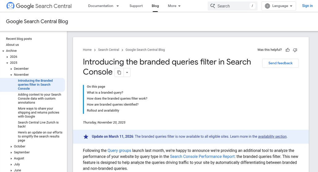
Doing this filtering helps get rid of data that skews the average, which would make your later posts seem like they underperform.
Step 4: Make Your Chart
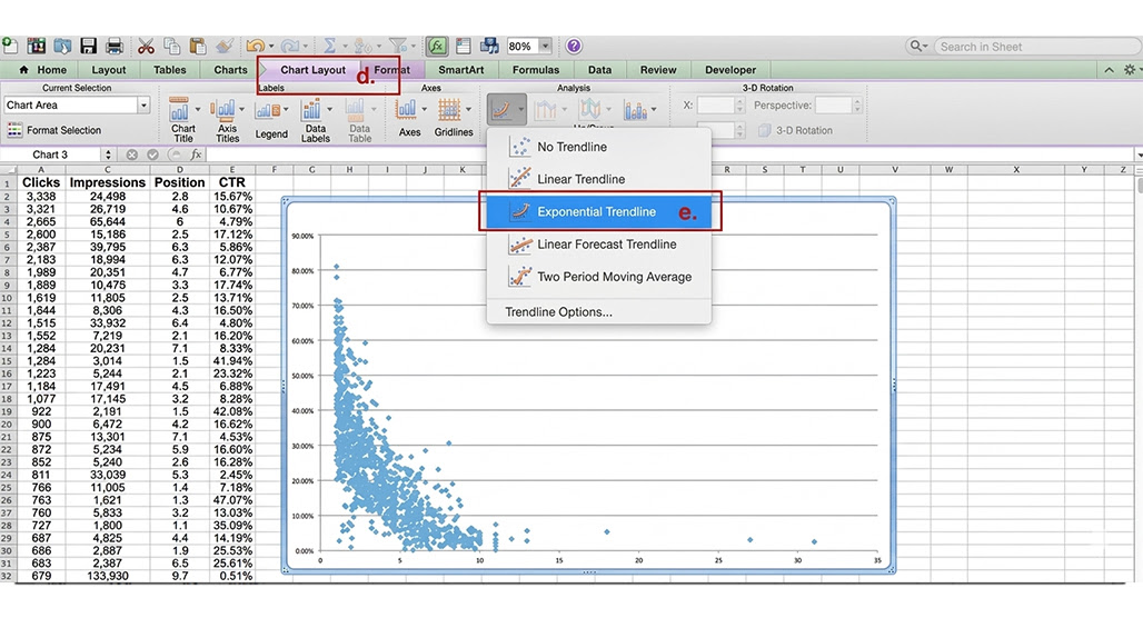
Next, you can use the handy scatter plot creation function. Just select the full columns for Position and CTR. Then, at the top under Insert, click Chart, and add a Scatter Chart.
This will give you a chart of all of the positions and CTRs. Now, you need to click on the "add chart element" box to the right and click on the trendline, adding an exponential trendline. This is your click curve.
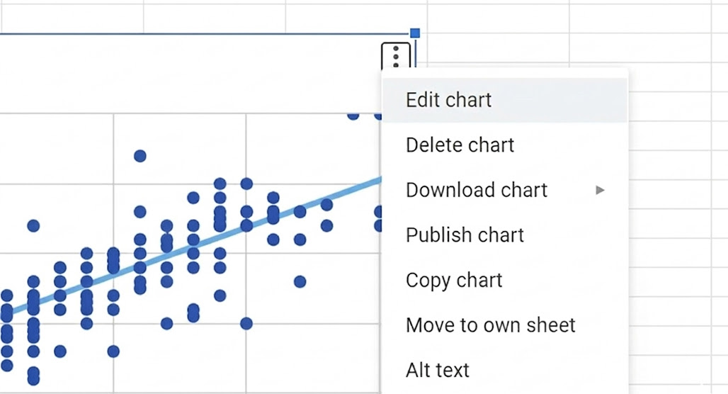
The process is pretty similar for Google Sheets. Select the data, click "Insert -> Chart" and choose Scatter Chart, and configure your options. Adding a trendline is similar too, just double-click on the chart, click customize, and add a trendline. Make sure to choose the right kind of trendline and the labels for the data you want, too.
Step 5: More Filtering
There's one more bit of filtering to do here. Technically, you could have done this before, but it's easier to see visually.
First, right-click on your chart and open the options menu. You want to find the trendline formatting, and make sure "display equation on chart" and "display R-squared value on chart" are checked.
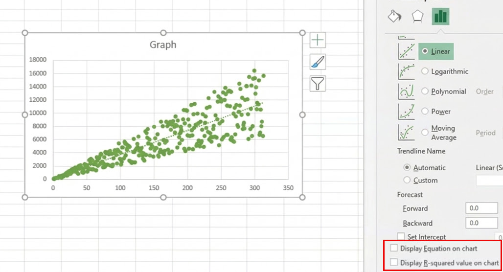
The R-squared value is a bit of a statistical measurement that tells you how well your data fits the trendline. Too many outliers and the trendline becomes less reliable; you want an R-squared value of 0.95 or greater for a truly reliable chart, but 0.6 is good enough for a click curve.
If your R-squared value is too low, you'll need to prune out the outliers. Identify the data points that are too far out of trend, since these are going to be posts that dramatically overperformed or dramatically underperformed. In either case, they don't represent an average case for your search performance, so they aren't useful. Remove them.
Step 6: Use The Click Curve Chart
Once your R-squared value is good enough, you'll see your equation for the line. That equation gives you your average values for position and CTR as they relate to each other, which allows you to then create a whole table of your average CTR per position.
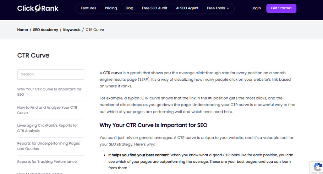
There's your predictive tool to estimate how a page can perform at a given rank, based on the rest of the data from your site. If you're finding that certain pages consistently underperform expectations, it may be worth exploring reasons Google won't rank your page for your keyword.
Ways to Use a Click Curve
There are a bunch of ways you can use a click curve, but they all basically come down to one thing: estimating if a particular page or keyword is worth creating.
For example, if you made the curve using keywords rather than pages (or have associated keyword data readily available), you can estimate the performance of new keywords you want to target based on their similarities to other keywords you already target.
If you add in more data, like the ROI for pages, you can then estimate the ROI for a given new page you want to create. Then you can prioritize new content based not just on the CTR, but on the value of those clicks as well.
You can also go back and do the same curve for branded keywords and pages, and look for new branding opportunities. The same goes for making multiple variations and comparing them, such as using the device data to estimate differences in user behavior between desktop and mobile users.
Another interesting option is to create curves for month-to-month or quarter-to-quarter. That way, you can showcase the difference in performance across seasonality. Some blogs are stable all year, while others are very seasonal, and knowing the seasonal differences can be important.
There are a lot of options here, and it's just one tool out of many to help you out. You'll notice that this doesn't account for things like competition or keyword difficulty, which is something you need to factor in through other tools.
Another failing here is accounting for Rich Snippets and markup. We know that rich snippets increase CTR, which is why using Schema is such a good idea, but this data doesn't distinguish between results with and without rich snippets.
Going back to the data you filtered, you can also look specifically at the outliers. Which pages over-performed? Can you dig into them and figure out why, and if there's anything you can replicate there? Likewise, what pages are under-performing, and is there anything you can fix? These insights are very useful.
Should You Make a Click Curve Chart?
Honestly? There's no real reason to go through and do this yourself unless you really want to play around with the data on your own and see if any unique insights emerge.
It's not because a click curve isn't useful. It's actually because this data is, more or less, available in most analytics apps already. There's not a lot to be gained from making it on your own when it's already done for you, with better statistical analysis attached, in a tool you're probably already using.
Another issue is that the data you export and work on is static. If you're using a click curve with static data, you're creating an equation that will be out of date in a few months. When you use a platform that already has click curves built in, they use the most updated data and can even be recalculated based on your choice of data on the fly.
Personally, I'm the kind of guy who loves getting technical, but more on the code side than the analytics side. I don't feel the need to reinvent the wheel when analytics apps have already done it for me, but if you're an analyst at heart, by all means. Any tool you can use to help you check your website's performance is a good tool.
So, that's my verdict: use click curves if you have an analytics app that makes them, and get such an app if you don't have one, but it's not likely worth the effort to go through making them all on your own.

Related Posts


Leave a Comment


Fine-tuned for competitive creators
Topicfinder is designed by a content marketing agency that writes hundreds of longform articles every month and competes at the highest level. It’s tailor-built for competitive content teams, marketers, and businesses.
Get Started