How to Use Google Trends Comparisons to Validate Topic Ideas
 Written by James Parsons • Updated May 21, 2026

The problem with content creation usually isn't the writing. It's that the topic validation step got skipped. Before putting time into a piece of content, it helps to know if people are actually looking for that subject - and how it stacks up against the alternatives you were thinking about.
That's where Google Trends comparisons become helpful. The tool lets you enter as many as five search terms at once and see how they measure against each other on a relative scale of 0 to 100. Instead of guessing which topic has more traction, you can see it directly, grounded in search behavior over time.
I'll walk you through how to use that comparison feature as a helpful validation step - so you can make better decisions about what to create before creating it.
Table of Contents
What the Numbers in Google Trends Actually Mean

The numbers you see in Google Trends run from 0 to 100. But they don't represent how searched for something. They show relative popularity - how much interest a term had compared to its own peak performance over the time period you selected.
A score of 100 means the term hit its highest point of interest in that window. A score of 50 means interest was about half of that peak. A score of 0 doesn't mean zero searches - it just means there wasn't enough data to display a helpful number.
That last point matters more than it seems. A score of 0 is Google's way of saying the search volume was too low to measure reliably - not that no one searched at all - it's worth keeping that in mind before writing a topic off based on a flat line. This is similar to how zero volume keywords work in traditional keyword tools.
Google also doesn't pull from every search that happens - it works from a sample of the billions of searches it processes. The results are still reliable and directionally accurate. But they're not a precise count of how many people typed something in.
Those values break down as follows:
| Score | What It Means |
|---|---|
| 100 | Peak interest for that term in the selected period |
| 50 | Half the interest of the peak |
| 1-49 | Lower but measurable interest relative to the peak |
| 0 | Not enough data to show a result |
The relative nature of the scoring is what makes comparisons so helpful. Because every term gets scaled against the same baseline - total searches across Google at that time - you can put two different topics side by side and get a fair read on how they compare.
One term scoring 80 and another scoring 20 tells you something about how people are distributing their attention between those ideas; it's the signal that's hard to get from a keyword tool alone.
How to Set Up a Comparison Search the Right Way
Google Trends lets you compare as many as five terms at once. To add more than one, just type your first term into the search bar and then use the "Add comparison" button that appears after your first result loads, and each term gets its own color-coded line on the chart, which makes it easy to read at a glance.
One of the first decisions you'll make is whether to search for a "search term" or a "topic," and it's worth mentioning the difference. A search term tracks only that exact phrase as typed. A topic groups together related searches across different spellings, languages, and variations - so it gives you a wider picture of genuine interest in a subject. If you want to dig deeper into the difference between SEO topics and keywords, it's worth understanding before you start comparing.
For most topic validation work, picking "topic" is the better move - it cuts back on the chance that you're missing a decent chunk of interest just because you phrase things differently. That said, if you're researching something very specific - like a product name or a coined phrase - then sticking with the exact search term makes more sense.

You can also filter by region and category after a comparison. The region filter helps you see if interest in a topic is concentrated in one location or spread out more broadly. The category filter narrows results to an industry, which is helpful when a term has multiple meanings across different fields.
A word on how to choose the terms you're actually comparing. Try not to put a very large term up against a niche one in the same chart. The large term will dominate the chart and compress everything else into a nearly flat line near zero. That doesn't mean the niche topic has no audience - it just means the scale is too uneven to read anything helpful.
A better strategy is to compare terms that are legitimately in the same weight class. If you want to know where a narrower topic fits, try comparing it against others of similarly sized topics first. You can also scrape data from Google Trends to build a clearer picture in steps across multiple comparisons.
Finally, don't skip the category and region filters even if you think they don't apply to you. A term like "Mercury" means something very different in an astronomy category versus an automotive one. Getting that filter right means your data aligns with the audience you're actually writing for.
Choosing the Right Time Range for Your Topic Goals
The time range you pick changes everything about what the data tells you. A topic that looks flat or dead over a five-year window could be climbing fast - you just can't see it at that scale.
Google Trends gives you a few range options, and each one is helpful for a different job. Short windows like "past hour" or "past day" update frequently and are great for checking if a topic is gaining real-time traction. These are less helpful for content planning, because a one-day spike doesn't tell you much about long-term demand.
For content validation, the most helpful ranges are "past 12 months" and "past 5 years". The 12-month view will teach you if interest is steady or seasonal across a full calendar cycle. The 5-year view lets you look at the bigger picture - if a topic is on its way up, holding steady, or fading out.
That longer history matters more than most people know. A topic that peaked hard in 2018 and has trailed off since then tells a very different story than one that has grown slowly and steadily over the same period. Both might show similar interest scores. But one is worth pursuing and the other probably isn't.

Seasonal patterns are also much easier to read over longer windows. If a topic spikes every December and drops in January, the 12-month or 5-year view will make that pattern obvious. Catching seasonal keywords early depends on having enough context to spot the pattern - the shorter windows would just show you a spike with no context to explain it.
Matching the Range to What You're Trying to Learn
To write evergreen content, you can use the 5-year view to double-check that interest has stayed steady. For seasonal content, you can use 12 months to time your publishing around peak demand. To chase a news-driven topic, the past day or past hour view gives you a live read on whether it's still active.
It's worth running more than one range on the same topic before committing to anything. A topic might look evergreen at the 5-year level but show a slow decline in the last 12 months; it's a detail worth knowing before you invest time in writing about it.
The time range is part of how you frame the question. Change the range and you change what the data is answering.
Reading Comparison Graphs to Spot Genuine Demand

When you run a comparison in Google Trends, you get a line graph showing relative interest for each term over time. The shape of the lines tells you quite a bit more than the numbers alone.
A healthy topic tends to produce a line that stays pretty flat or grows slowly over time- it does not need to be perfectly smooth. But it should hold its ground across months or years.
A spike-and-drop pattern looks very different. The line shoots up sharply and then falls almost as fast, returning to near zero- this tells you that something external drove a short burst of searches. The underlying interest was not there to sustain it. Chasing a topic like this without knowing what caused the spike puts you in a tough position later.
Comparing terms side by side is where this gets helpful. One term might show a strong, steady line while another shows a few dramatic peaks with long flat stretches in between. That contrast helps you see which topic has an audience and which one depends on outside events to get attention at all.
It is worth knowing that this data carries analytical weight. The OECD used Google Trends data in 2020 to track GDP changes in near real time, because search behavior reflects what people are actively thinking about. That context matters when deciding how much trust to put in what the graph is showing you.
One thing to watch for is a topic where the competing terms look flat. That does not automatically mean the topic is worthless- it can mean the audience is stable, which is sometimes what you want for a niche subject.
The most useful habit to build is to look at the full shape of each line before drawing any conclusions. A single high point can distort your reading of a graph if you are not paying attention to what surrounds it. Step back and look at the whole picture before deciding a topic has legs.
Seasonal Patterns and Why They Can Fool You

One of the easiest traps to fall into is seeing a high interest score on a topic and assuming the demand is there year-round. A topic can look very strong in Google Trends and still be dependent on one time of year to get that attention.
Think about something like "last-minute Christmas gift ideas." It will score near 100 every December and then flatline for the other eleven months. If you publish that content in March, you are not going to see much return on it for a long time. The interest is there - it's just not available to you when you need it to be.
The fix is to look at a longer time window. Switch your view to the past five years instead of the past twelve months - this gives you a more honest picture of what is happening with a topic over time.
The question worth asking is whether this topic comes back every year at roughly the same time. If the answer is yes, you are looking at true seasonality. That is actually helpful information. You can plan to publish a few weeks before the interest starts to climb and be ready when the audience arrives.
But if the topic spiked once and never came back, that's a very different story. A one-time spike usually means something external drove the interest - a news event, a viral moment, or a product launch. Once that moment passed, so did the audience. Publishing on a topic like that now is unlikely to bring in steady traffic.
The multi-year view also helps you tell the difference between a topic that's growing and one that's fading. Some topics show seasonal peaks that get slightly higher each year - that's a good sign. Others show peaks that are smaller and further apart.
So before you follow a topic that looks strong on paper, run through a quick mental check. How many years does the data cover and does the pattern repeat? Is the peak stronger or weaker over time? And if you are looking at a topic in the middle of its off-season, you should think about whether the timing works in your favor or against it. Matching your publishing schedule to a topic's natural rhythm can make a difference to how that content performs.
Using 'Trending Now' to Catch Topics Before They Peak
Most of what I've covered so far deals with historical data - looking back at how a topic performed over time. The Trending Now feature in Google Trends works differently - it shows you what people are actively searching for right now.
You can filter the Trending Now window by the past 4 hours, 24 hours, 48 hours, or 7 days, and each timeframe gives you a snapshot of topics that have seen a sudden rise in search activity. The shorter windows are more reactive and raw. But the 7-day view starts to show which stories have had some staying power.
This feature is less about validation and more about timing. The comparison tools covered earlier help you decide if a topic is worth pursuing. Trending Now helps you decide whether to move on it before the window closes. These are two different questions and both matter.
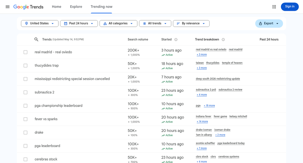
Treat Trending Now as an alert system instead of a final answer. If you see a topic rise there, take it into the comparison tool to check how it holds up against related terms. A topic that's trending hard in a 4-hour window but shows no historical depth might not be worth a full piece of content.
Trending topics can move fast and fade just as fast. Something that spikes on a Monday afternoon could be irrelevant by Wednesday morning. That does not mean you should ignore these topics - it means you'll have to be honest about the content you are writing. A news-style post or a quick take can do well on a fast-moving trend. A long-form guide probably can't. Different types of blog post styles suit different kinds of trending content.
The most helpful strategy is to use both tools. Use Trending Now to find the opportunity and the comparison strategy to stress-test it. If a trending topic also shows steady historical interest and holds up well against a benchmark term, that's a much stronger signal than trend data alone.
Not every trending topic will be relevant to your audience either - it helps to scan Trending Now with your niche in mind and skip anything that's outside it. A random viral news story is not automatically a writing opportunity just because people are searching for it right now. Tools like TikTok search data can help you cross-reference whether a trend has broader momentum beyond Google.
Turn Your Topic Guesses Into Confident Choices

The next time you're stuck between two or three ideas, open Google Trends and make a call. Run the comparison, look at the shape of the lines over time, and let the data push back on your assumptions - it won't make the choice for you. But it will make a much stronger case for one direction over another.
Like most research habits, it takes a little practice before it feels natural. After a few rounds of comparing terms, finding seasonal patterns and rising trends, and catching misleading spikes, it can become a quick and almost instinctive part of how you review ideas - one that quietly saves you from wasted effort later.

Related Posts



Leave a Comment


Fine-tuned for competitive creators
Topicfinder is designed by a content marketing agency that writes hundreds of longform articles every month and competes at the highest level. It’s tailor-built for competitive content teams, marketers, and businesses.
Get Started